Help / Analytics: budget health, trends and spending
Analytics: budget health, trends and spending
The Analytics panel on your dashboard is a collapsible section summarising how your budget has tracked across your completed pay cycles. Everything in it is calculated on your device from your own history. It has three parts.
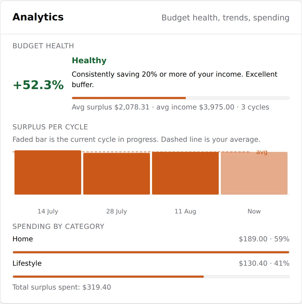
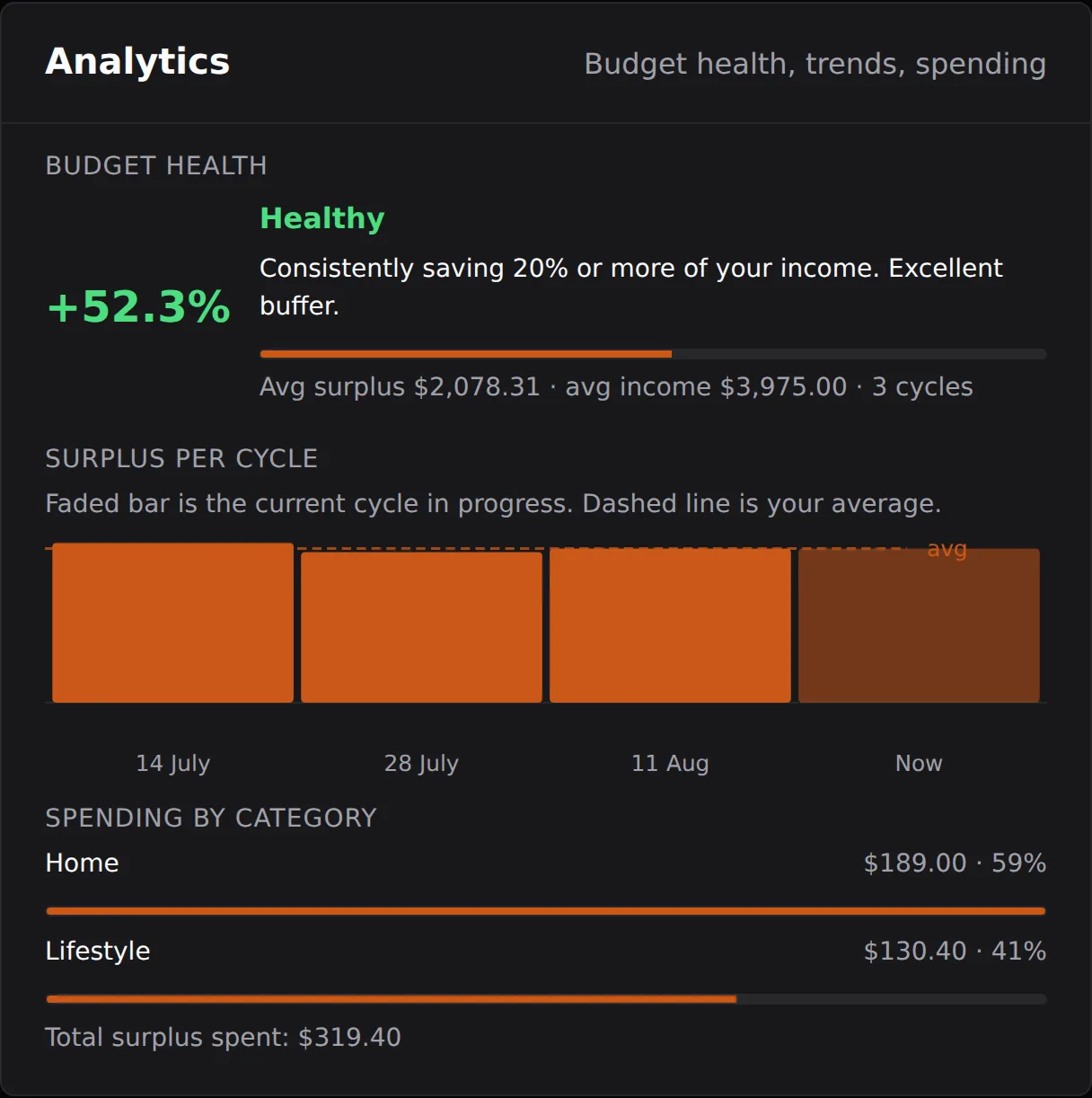
Budget health
Your average surplus as a share of your average income across completed cycles, shown as a percentage with a plain reading: Healthy (20% or more), On track (10% or more), Tight (5% or more), or Under pressure (below 5%), along with the averages behind the number. It describes your completed cycles and updates as each new cycle completes.
Surplus per cycle
A bar chart of the surplus from each completed cycle, plus a faded bar for the current cycle in progress and a dashed line marking your average, so the trend across paydays is visible at a glance.
Spending by category
Your logged surplus spends grouped by category, with each category's share and the total spent. Spend categories are yours to add, rename or remove in Settings.
Analytics reads only your own completed history, so a brand-new budget starts empty here and fills in as cycles complete.